We always like to see a project through from start to finish. The logo design for Balance let us do just that.
Russell at Balance is doing great things. His business tackles the overuse of plastics in shopping. He has created a waste free environment where shoppers take their own containers to refill. Helping to balance the world. This ethos was something he wanted to get across in his branding. Wanting to have elements of nature in the core design.
Artist and designer Phil wanted to give him some options that would reflect his business whilst making sure it wasn’t corporate and cold. Developing the original logo into something fresher.
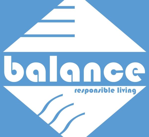
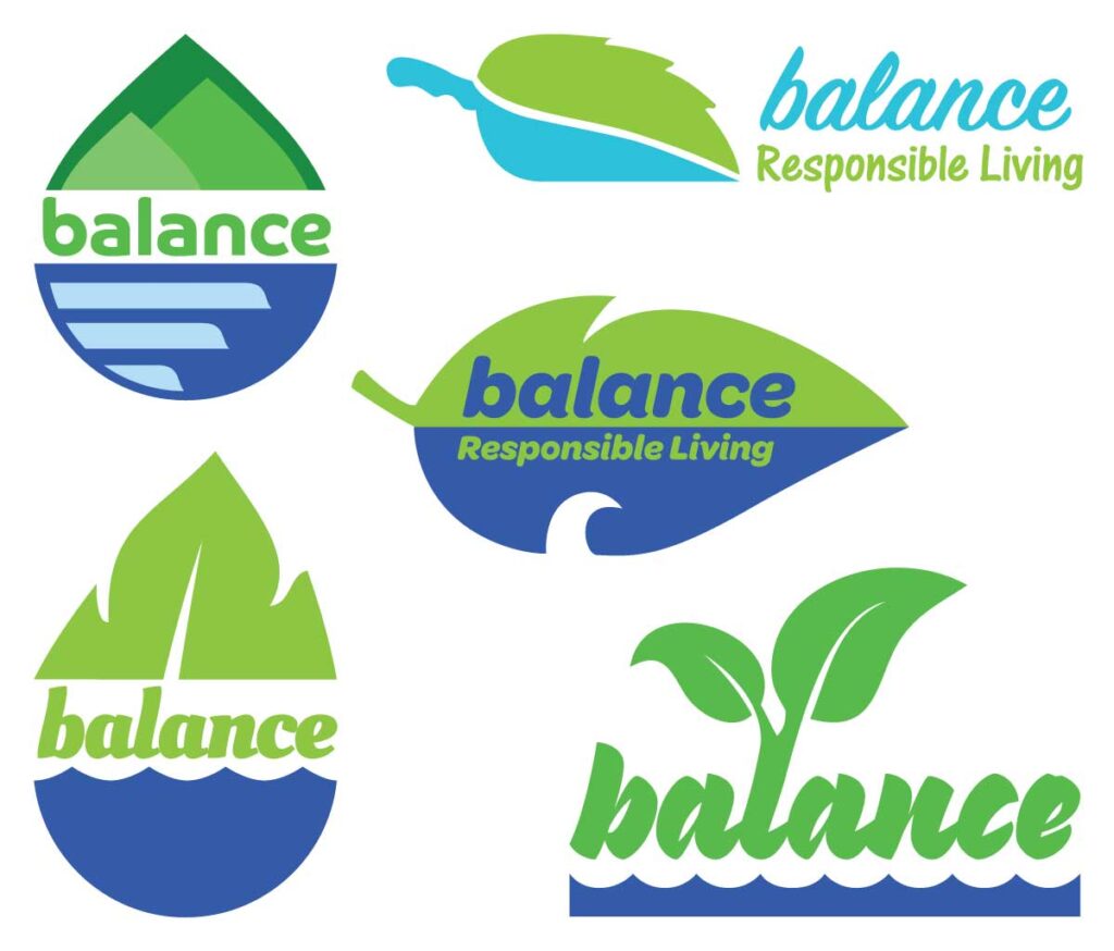
Concept Designs
To start with the logo needed to have reference to earth and water. These were key elements that he wanted to carry across. To make the logo more accessible it was placed into natural forms and given a fresher colour palette. Trying the scoops from the shop as part of the design. From these the water droplet was the most concise. Next came the typefaces.
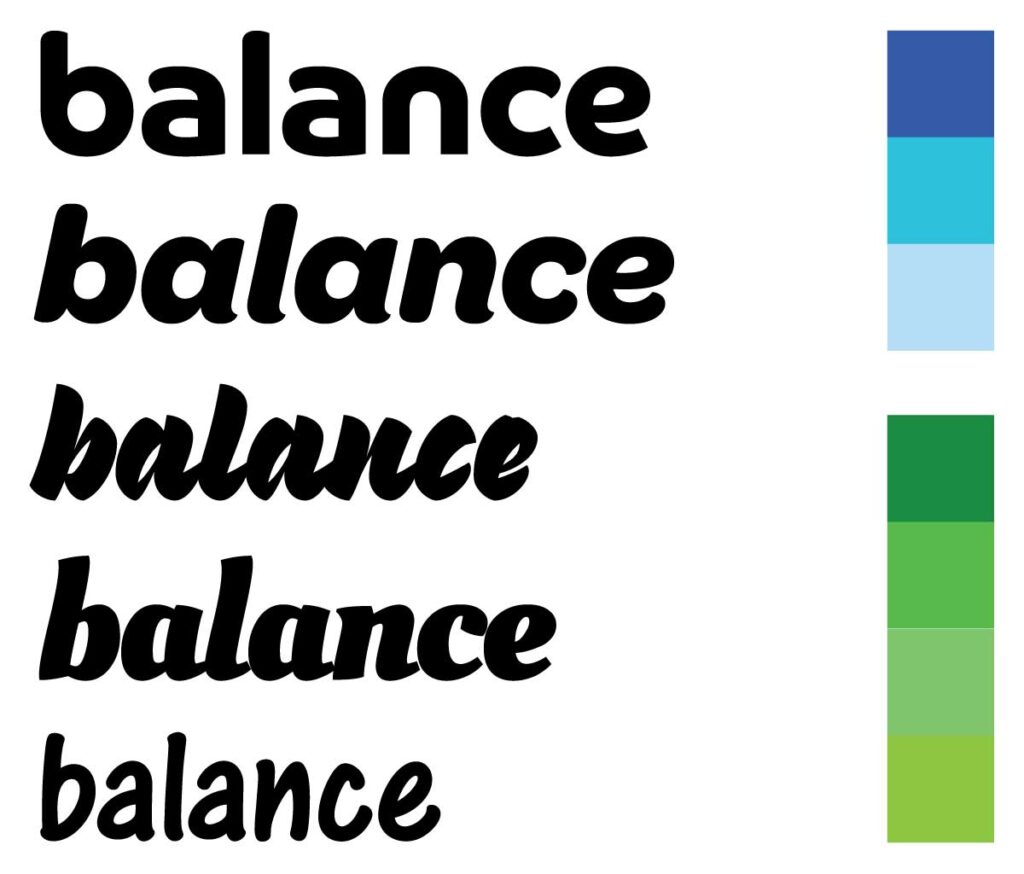
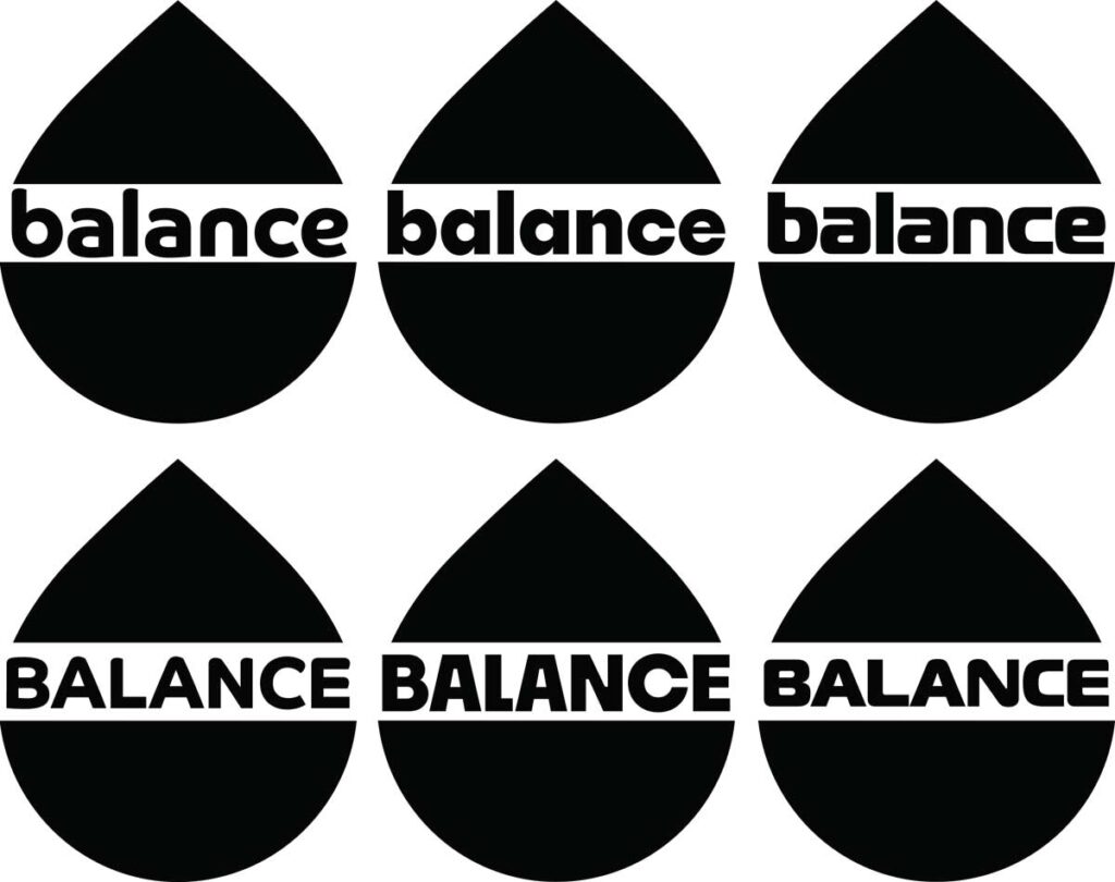
Friendly balanced typography
It was important to use a strong typeface. To give the logo the approachable look. As mentioned Russell wanted a less corporate look. We gave him several options in mock ups of the final shape to see how it would fit. From the original phrase of Balance the World, it was only Balance that would be in the core logo.
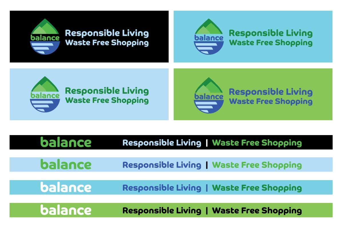
Colour and Layout
Finally when all the elements had come together we finalised the colour palette for the digital and printed content. Using hex colours to mix enamel paints for the exterior signage. Packaging and sending Russell digital content for him to use. This clean design helps to keep the business up to date. The vibrant fresh colours elevate the logo. We really enjoyed working with Russell as he was such a responsive positive client.